Technical Analysis
Introduction to Technical Analysis
What is Technical Analysis “Technical analysis” is an industry term that more often than not sounds much more complicated than the actual process is. Really, it ought to be referred to as “price analysis”, as this would be a more accurate description. Through the use of charted data traders around the world analyze their market of choice. The objective: determine future price movement. The means: understanding price movement patterns of the past.
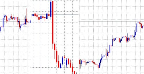
The charting of price movements creates a visual tug-of-war between buyers and sellers. The large majority of Technical traders in the Forex market focus their attention on candlestick data, a method of charting that offers a visual interpretation of the high, low, open and close of a currency price within a certain time frame. Combined with various forms of pattern recognition (which will be covered later in the course) candlestick charting offers traders a visual look at the market’s past prices and trends. Analyzing this historical data in order to predict the movements of future prices is the process known as “technical analysis”.
Why Does Technical Analysis Work? Technical analysis is often dispelled as a myth, even a fool’s errand. There are those who believe that price movement is completely random and completely unpredictable. True, technical analysis is never an exact science (predicting the future never is). However, the true fool would be he or she that ignores the power of technical analysis, particularly in the Forex market.
Analyzing price patterns is actually very similar to analyzing human behavior. While humans can at times be unpredictable in nature, humans are typically considered to be creatures of habit. The average human adheres to certain paradigms, paradigms that are rarely broken. Do you brush your teeth or shower first? Do you comb your hair before or after you shave? The point: if one were to observe an average person’s daily routine before leaving the house for work their behavior may seem random or without purpose. However, if one were to observe the same human day after day, within a relatively short amount of time it would not be hard to outline that person’s morning routine. In fact, nine times out of ten you would probably be able to predict with impressive accuracy how your observed creature would prepare for their day, perhaps even down to the minute.
The Forex market is also a creature of habit. Analyzing price movement is effective because the past can teach us how human beings (the real living and breathing organism of this market) will react to certain situations. History does repeat itself. Technical analysis offers the Forex trader a certain level of expectancy when considering future price movements. In a sense, accurate technical analysis is a trader’s true edge. There is no crystal ball for predicting the future of the market, though there are keys to understanding patterns, past, present and future.
When Does Technical Analysis Fail? Technical analysis fails when traders fail to consider the fundamentals. Why mention fundamental analysis when explaining technical analysis? Simple, the one just doesn’t work without the other. Fundamental factors such as political events, a hike in interest rates, unemployment rates and so on will impact the Forex market more substantially than perhaps any other market. Fundamental factors are often the driving force of major price movements. A trader focused on technical analysis cannot ignore Non Far Payroll on the first Friday of the month and expect his or her technical indications to be as accurate as the day prior. Purely technical traders understand that certain political factors throw all other price forecasts out the window.
Basic Concepts
Charting & Charting Styles ‘Charting’ is essentially the most basic component of technical analysis. As such, some would argue that the more raw and basic data plotted on a chart is of little use to the technical trader. Instead, they might argue that a technical trader needs more advanced indicators as a means of determining price direction. Indicators such as moving averages, momentum indicators, oscillators and so on… will, ultimately be of grand use to the technical trader, but not without first learning the basics!
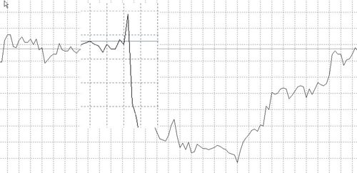
Line Charts There is nothing more basic than a line chart. A simple visual representation of data, the Line Chart plots the closing price of a single day and over the course of weeks and months connects the dots. The below image shows an example of a basic line chart:
The line chart’s simplicity is often seen as its strength. Or so it may be in other markets. In the Forex market the line chart offers very little insight into the market’s volatility or movement within the time frame of a single day. As most Forex traders are ‘day traders’ (often in and out of positions in a 24 hour period) a line chart, even if plotted by the hour, would still leave much to be desired. As we continue to explain other charting methods, the previous point will make more sense!
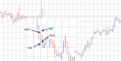
Bar Charts Bar charts are in essence the less visually appealing version of Candlestick charts. Candlestick charting is the most popular method used by today’s Forex traders. However, it might be important to understand the one before the other. A Bar Chart displays a price’s open, high, low and closing prices. As shown in the image below the top of the bar chart represents the highest price of the period, and the bottom of the bar represents the lowest price of the period. To the left and right side of the bar are “ticks”, the left tick represents the open price of the period and the right tick represents the close price of the period.
Bar Charts Bar charts are in essence the less visually appealing version of Candlestick charts. Candlestick charting is the most popular method used by today’s Forex traders. However, it might be important to understand the one before the other. A Bar Chart displays a price’s open, high, low and closing prices. As shown in the image below the top of the bar chart represents the highest price of the period, and the bottom of the bar represents the lowest price of the period. To the left and right side of the bar are “ticks”, the left tick represents the open price of the period and the right tick represents the close price of the period.
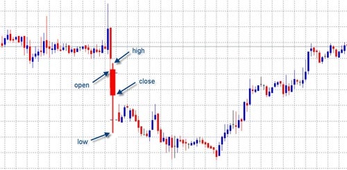
Candlestick Charts Really the only choice for today’s Forex traders, the candlestick chart offers the same information as does a bar chart, but does so in a much more ascetically pleasing manner. As is illustrated in the two images below the candlestick is comprised of a “body” and an upper and lower “wick”. The body of the candle is typically a dark color when the close is at a lower price than was the open (a bearish candle). Conversely, if the close is at a higher price than was the open the candle will be a light color (a bullish candle). The wick of the candle represents the entire range of price for that period. The top of wick of course represents the price at its highest point, while the bottom of the wick represents the price at its lowest point. A quick glance at a candlestick will tell a trained eye literally everything they might want to know about a price within a certain time frame, i.e. what was the high and low price, was it bullish or bearish, where was the open and close. A trader can also quickly glance at a series of candles and with little thought note how many consecutive candles have been bullish or bearish; which in conjunction with other technical analysis often serves as an appropriate timing method to enter a trade.
What am I Looking For? More often than not, traders in the Forex market doom their own technical analysis. The reason is simple; they look at a chart and try to remember everything that they have ever studied about technical analysis. Before long it seems that one philosophy only contradicts another, an obvious entry becomes a source of confusion and so on. Some of the best traders in world have a bit of a mental check list that is always considered when analyzing a chart. However, they also know that too many technical indicators used in conjunction with one another is a fast track to a certain demise.
There are certainly a few things that you are going to want to consider when looking at a chart. As the course continues you will be better prepared to compile your own trading style. For the time being, consider the following a check list for the novice. Ask yourself what the chart on your screen is telling you, and which of the following considerations are worth considering:
Is there an obvious trend or direction of the market within the time frame that you are viewing?
Are there any basic chart formations such as ascending or descending triangles, wedges, pennants, double tops or bottoms or otherwise that might suggest a pending breakout or trend reversal.
Is the market trading within the walls of any obvious support and resistance levels, or is the market trading within a channel?
Have you considered at least two technical indicators, i.e. two technical indicators that complement each other well?
Have you ignored the impulse to consider every technical indicator that you have ever read a paragraph or two on?
You should now understand at least the basics of what a technical trader is looking for when analyzing a chart and the market. As we continue to dissect various technical indicators and forms of pattern recognition your skills will be refined, for the time being it is enough to know, if nothing else, what it is that you will ultimately be looking for.
Support & Resistance Trends Fortunately for traders in the Forex market, dealing in this market is often about dealing in trends. It is often said that ‘the trend is your friend’; there is truth to this, but only when a trader understands why the market trends and the underlining factors that can often disassemble a forming trend (these factors will be covered throughout the course as we further analyze technical analysis).
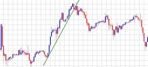
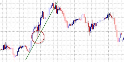
The image above shows an example of an upwards trend. Notice that the trend line was drawn by identifying the lowest low of the trend and connecting the line to the following low preceding a new high. A solid trend line should continue in this manner until at least four lows followed by new highs are plotted. This trend line can also be referred to as a support level. In other words, think of this line as if it were the roof of a house. During this trend period the price range is going to crawl along the roof of the house. In an upwards trend we are obviously looking for an opportunity to buy. It is generally taught that a trader’s best buy entry point during an upwards trend would be at the lowest low of the candle on the third touch of the support level, as shown below:
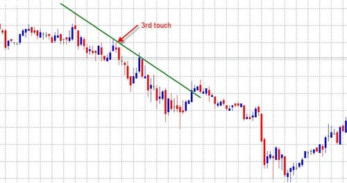
Just the opposite of an upwards trend, in a downwards trend our trend line can be referred to as a resistance level. Now as opposed to trading along the outside of a roof we are trading along the top of the ceiling. During this trend a trader can assume that the price is often going to reach the ceiling, but never push through it. A trader following a well developed downwards trend is looking for an opportunity to sell on the third touch of the resistance line at the highest possible point of the candle, as shown below:
Timing an entry point within a trend is as key as recognizing a trend, as obviously they will not last forever. First consider the time frame of the chart that you are viewing in relation to the likely continuance of the trend. As mentioned earlier, we are usually looking to buy or sell on the third touch of a support or resistance level within a trend. Using historical data in your charts, you will notice that the average trend will not provide more than 3 to 4 additional touches of the support or resistance after the first 3 that would have inspired you to note the trend to begin with. Thus, depending upon whether you are viewing a 1 minute chart, a 5 minute chart, or so on you will need to gage an estimated time frame within which you will trade.
Pattern Recognition
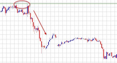
Double Tops & Double Bottoms Double Tops do not only provide technical traders with a firm indication of a beginning downward trend; they also prove that price movement is not random, but rather is a clear indication of market sentiment. Double Tops occur when a new high is plotted, raising the resistance level. The price then retraces and declines, only to rise again and reach the same high or resistance level.
As can be seen in the image above Double Tops can be thought of as true market sentiment. Traders around the globe push the price to a new high; because the new high is a tad extreme the price is subsequently brought back down. Again traders push up to the same level, testing it just one more time; again the price feels too extreme. The market has decided that an upwards trend is just not in the cards, twice a new high was tested and twice the market sold to push it back down. After noticing a Double Top a trader is very safe to assume that for the time being the market will move in a downwards trend, thus affording an opportunity to sell, or exit a soon to be falling long position.
Of course, Double Bottoms are just the opposite of Double Tops. Twice the market will test a new low, and twice the market will refuse the idea of pushing beyond that point. The buyers will rally and an uptrend will follow.
Triangles There are three types of triangles that technical traders focus on: (1) Ascending Triangle
(2) Descending Triangle
(3) Symmetrical Triangle
Ascending triangles are considered bullish pattern formations, though depending on whether they are formed during an up-trend or a down-trend they may have different implications towards future price movement. Spotted within an up-trend an ascending triangle is typically considered an indication that the upwards trend will continue. Just the opposite, if an ascending triangle forms during a downwards trend it is considered an indication of a trend reversal. Essentially, ascending triangles are comprised of a series of candles that, in accordance with the pattern’s name, form the shape of a triangle. The term ascending triangle refers to the fact that the triangle’s two trend lines are not created equally; the top line of the triangle will represent a fairly even level of high prices, while the lower level of the triangle will represent a continued series of higher lows. The consolidation between buyers and sellers at an upward slant suggests pressure from the buyers. The resistance line can typically only hold for so long before the buyers get the best of the sellers and the price breaks out in an upwards trend, at which point the resistance level often becomes the new support level; or for a seasoned trader, a wise level to place a stop loss. The image below shows an example of an ascending triangle. As can be seen, it is generally safe to assume that the triangle will break out at least five candles before the actual point of the triangle would form.
Descending triangles , naturally, are just the opposite of ascending triangles. In a downwards trend the triangle forms as an indication that the trend will continue downwards. In an upwards trend the triangle forms as an indication of a trend reversal. Descending triangles are formed when there is a series of progressively lower highs and relatively even lows. As can be seen in the image below the top line or resistance line of the triangle will be angled down, while the lower line or support level will appear as a level horizontal line.
Symmetrical triangles are most often considered a continuation pattern. Symmetrical triangles can be seen as a series of lower highs and higher lows develop forming the shape of a triangle. This pattern represents a struggle between buyers and sellers, as is usually the case with price consolidation; more often than not symmetrical triangles precede a price breakout. Though it is generally safe to assume that symmetrical triangles will only present themselves as an indication that the current trend either upwards or downwards will continue, this may not always be the case. The good news for seasoned traders is that one need not really know ahead of time where the market will head, the true key is simply to spot the symmetrical triangle developing. As can be seen in the example below once the support or resistance line of the triangle has been penetrated by two to three consecutive candles the trend will more than likely continue in that direction, thus offering traders an excellent entry point.
Wedges Wedges are often considered a difficult pattern to recognize, and or are often confused with triangles. The distinction between wedges and triangles is actually quite clear to the trained eye. The key to spotting the difference is found in the slant or the angle of the support or resistance line. When observing triangles notice that ascending triangles show a flat or even resistance line, conversely descending triangles show a flat or even support line. Symmetrical triangles, as their name suggests, are neither slanted downwards or upwards.
There are two types of wedges; rising wedges and falling wedges. Falling wedges are considered bullish pattern formations. When found in a downwards trend the falling wedge suggests a reversal of that trend. When found in an upwards trend the falling wedge suggests a continuation of the upwards trend. The falling wedge is formed by a series of lower highs and lower lows. Notice that both the support and resistance levels of the wedge are slanted downwards, setting the wedge aside from what might be mistaken as a triangle pattern formation. Prices within the falling wedge will continue to tighten until the resistance line is finally penetrated and the breakout upwards begins. Timing a falling wedge is much like timing a triangle formation; one can generally assume that after two to three candlesticks have pushed through the resistance line it is then time to consider hoping on the bandwagon with the rest of the buyers.
Rising wedges, just the opposite of falling wedges, are considered bearish pattern formations and are represented by a series of continued higher highs and higher lows which are narrowing or consolidating. The rising wedge suggests to the trained eye that though the buyers are reaching new highs, these highs a progressively tighter and tighter. These progressively tighter highs indicate that the upwards trend is losing steam. Thus, a rising wedge found in an upwards trend would suggest a trend reversal and a rising wedge found in a downwards trend would suggest a short rally from the buyers, but ultimately a continuation of the downwards trend. See image below:
Flags & Pennants Flags and pennants are perhaps the most common of continuation patterns. Spotting a flag or a pennant usually begins with noticing the flag pole, or for more practical purposes, the trend line. Flags and pennants typically form after a substantial trend up or down as an indication that the price is consolidating, or being tested before continuing in the initial direction of the trend. Often the consolidation period (the flag or pennant) is slanted in a direction opposite of the initial trend, this demonstrates the market’s hesitation to continue upwards or downwards, but ultimately it is nothing more than a brief hesitation and an indication to the trained eye that there is safety in staying with the initial trend. Though both flags and pennants indicate a continuation of the current trend, there is a distinct visual difference between the two. The flag will be represented by a more rectangular consolidation period, both support and resistance levels will be about an equal distance from one another. A pennant on the other hand will be represented by support and resistance levels that are moving towards one another in the shape of an asymmetrical triangle. Both the flag and the pennant are always spotted at the end of the flag pole, or at the end of a sharp directional trend.
Head & Shoulders / Reverse Head & Shoulders Usually found after a long trend either up or down, as its name suggests head and shoulders are named after the human form. Consisting of three peaks, one of which (the head) is centered and higher than the two lower and relatively equal peaks (the shoulders). Head and Shoulders is perhaps the most well known reversal pattern within technical analysis. Formed after a long upwards trend the left shoulder begins to form while still in the upwards trend. Essentially the left shoulder forms as prices rally up and quickly thereafter retrace, typically the upwards trend line, or resistance level will not be broken as this happens. Notice that the left shoulder seen alone can also be viewed as a forming flag. As the left shoulder finds its end, prices again rally, this time to a new high which will become the head of the pattern. After the high peak or head of the pattern is formed and prices have retraced back down, again prices will rally to near the same level as the left shoulder to form the right shoulder. Essentially, within an upwards trend prices have attempted to rally three times and each rally has seen limited success, or in other words has been rejected by the sellers. Once the right shoulder breaks through the imaginary support line equal with the right shoulder (the neck line) the reversal of the trend has officially begun. Buyers have tried to continue the upwards trend, and three times have lost their battle to the sellers. A trader who has spotted a forming head and shoulders pattern can usually be quite sure that he or she has seen the end or a long upwards trend. It’s time to cut your losses, secure your profits, or short the market.
Every pattern within technical analysis seems to have its opposite, head and shoulders is no exception to this rule. Reverse head and shoulders represent essentially the same situation as normal head and shoulders, but of course are found in long term downwards trends as opposed to long term upwards trends. Instead of the head and shoulders represented by new peak highs they are represented by new peak lows. The reverse head and shoulders tips the trader that the downwards trend is losing steam as three new lows have been tested and each time bested by the buyers in the market. Again, it’s time to cut your losses, secure your profits, or this time, long the market.
